

Table of Contents
- 1 Definition of Membership Page Design
- 2 The Benefits of Effective Membership Page Design
- 3 Membership Page Design Tips and Best Practices
- 4 Conclusion
If you’re new to subscription businesses, membership page design seems trickier than tackling a fire-breathing dragon.
And you are not alone.
The idea of creating effective membership page designs is far-fetched for many beginners.
Because…
- Where do you even start? Starting or running a successful membership website is already tough as it is, let alone optimizing page design;
- Which colors or fonts do you use? Have you ever heard of color theory and how it can impact your conversion rates?
- How about images or videos? Which ones resonate with your target audience? And which ones should bite the dust?
- Where do you even place your call to action (CTA) buttons?
- And can you create a clean, user-friendly layout without pulling out your hair?
- What about the touchy issue of web accessibility that over 90% of web designers forget?
We get it.
Designing the perfect membership pages feels like a tall order for many first-timers.
But that’s probably because you don’t know it’s incredibly easy – even for beginners.
And probably also because, up until today, you hadn’t found this ultimate guide to membership page design 🙂
In today’s post, you will learn all about designing effective and engaging membership pages for your website.
We will explore design tips and best practices for optimizing membership pages to attract and retain subscribers.
If that sounds like a good idea and exactly why you’re here, let’s hoist the anchor and set sail!
Definition of Membership Page Design

This section is for the perfect beginner new to all this design thing.
Just to put it out there, I was lost when I first came across the idea of membership page design.
That means I have been in your shoes before.
Besides, I would hate to confuse you with web design jargon and tough concepts later in the article.
So, ladies and gents, what is membership page design?
Well, membership page design is the process of creating effective pages for your membership website.
Rather simple. Right?
The whole purpose of the process is to create delightful membership pages that attract, engage, and convert mere website visitors into free or paying members. Or what we normally call subscribers.
In addition, the process involves optimizing existing membership pages to reduce churn rate and retain more of the members you’ve already acquired.
In other words, let’s call membership page design “effective website design” for membership websites.
Pro tip: Don’t worry one bit if you don’t know anything about website design. Nowadays, countless visual tools let you create impeccable designs without writing code.
In addition, you have specialized membership platforms such as Paid Member Subscriptions that come with pre-made member pages that you can customize or use right out of the box.
Still, you might be tempted to think a lot goes into effective membership page design.
But…
The process mainly entails designing membership pages that:
- Optimize user experience across your entire membership site;
- Boost conversions through your membership funnel;
- And facilitate long-term engagement after members have registered.
I hope that makes sense.
You must agree it’s a pretty simple idea to grasp. Right?
Now that this membership page design doesn’t sound like an alien from a galaxy three billion miles away, let us discuss the benefits.
Later, we will delve deeper into practical design tips. After that, we will cover a few best practices.
The Benefits of Effective Membership Page Design

Normally, beginners will slap together a membership site, add some content, and wait with duffle bags ready to collect the loot.
And then they are disappointed because things didn’t pan out as expected.
First-timers usually don’t consider how their page designs will affect their membership business.
We can attribute this to poor planning (or starting without a plan), and sheer glee to hit the ground running.
It goes something like this:
Let me create a membership website and hope something will stick.
After all, the internet “gurus” say it’s super-duper easy, a 12-year-old can pull it off in their sleep.
The only catch is you have to buy some “magic system” they’re selling.
These are gimmicks because starting and running a membership site takes astute research, proper planning, proven tools, and agile execution. Well, among other things.
Don’t fall for these cheap tricks. For instance, these gurus won’t tell you that your membership website design matters because you won’t buy into their schemes.
So, they will bundle a CMS with poorly-made page designs and sell you the “ultimate package to make you a millionaire overnight.”
Among other things, effective membership page design influences whether your membership business will fail or succeed.
Here is why you should pay close attention to the design of your membership pages.
1. Enhanced User Experience (UX)
The first benefit of effective membership page design is enhanced user experience. This is one of the best benefits of taking the time to create appealing member pages.
Let me ask you a quick question.
Have you ever been on a website (or even a mobile app) that was so difficult to use that you felt like crying? Particularly because you needed what they were offering?
I know I have. I disliked the user experience so much that I left irked and without taking any action.
Do you think I would consider returning to such a website or app?
Never!
Your membership website shouldn’t give visitors such bad experiences.
On the contrary, you should fine-tune your page design to offer users a pleasant experience that makes them want to stay and interact with the rest of your content.
What to do?
For starters, good membership page design should prioritize seamless navigation. Make it incredibly easy for people to find the content and features they need without breaking a sweat.
Using your membership website shouldn’t feel like finding your way through the Cretan Labyrinth or the Catacombs of Paris.
My point is: Don’t make your site visitors feel trapped. Otherwise, people will feel lost on your membership website and leave, costing you traffic and conversions.
Create smooth navigation that leads users to the main objective: subscribing to your membership.
To see how other entrepreneurs like yourself implement seamless navigation on their membership websites, please don’t hesitate to check out this article: Successful Membership Website Examples + How To Create Your Own.
Make Your Membership Pages Accessible to All Users
Did you know that only 3% of the internet is accessible to people with disabilities? Sad, right? So much for inclusivity.
That said, it’s important to ensure that your membership pages are accessible to all users regardless of their limitations be they auditory, cognitive, motor, or visual.
But how?
I’m glad you asked. Here’s a quick list of what to add to your pages to make them accessible to all individuals.
- Use semantic HTML and adhere to web standards – Use elements such as headings, lists, descriptive alt text, and landmarks to provide context and structure for people who use assistive technologies;
- Follow accessibility guidelines – Learn and adhere to standard accessibility guidelines such as Web Content Accessibility Guidelines, and WAI Accessible Rich Internet Applications;
- Add keyboard shortcuts – Ensure your membership pages don’t force all visitors to use mouse interactions. Instead, ensure all elements on your membership pages are accessible and operable via keyboard shortcuts;
- Test repeatedly with aides – Test your member pages using assistive technologies such as voice recognition tools, screen readers, and magnifiers to ensure your website is usable to all and sundry;
- Use sufficient color contrast – Apply adequate color contrast to boost readability for users with color blindness and other visual impairments;
- Use web accessibility assessment tools – Lastly, check your website with online accessibility evaluation tools to identify issues you must fix.
So, why is making your membership pages accessible crucial?
Why Make Your Pages Accessible?
Firstly, it makes your membership website inclusive, ensuring people with disabilities can access your content without barriers.
Secondly, many countries have laws and regulations that require you to create an accessible website usable by all users. A popular example is the Americans with Disabilities Act (ADA), which protects people with disabilities from discrimination.
Thirdly, an accessible membership website can reach a wider audience, including impaired users, aging populations, and anyone using assistive technologies.
The White House website is a prime example of how to implement web accessibility.
Without a doubt, we understand web accessibility is still challenging, and we have a long way to go.
But with the above tips and links, you can start taking steps in the right direction and make your membership pages accessible to all users.
Let us move on.
Make Your Membership Page Design Responsive and Mobile-Friendly
Come on, we live in the 21st century where people use different devices with varying screen sizes to access the internet.
As such, why would you want to create membership pages that run off the screen on mobile devices? That’s akin to shooting yourself in the foot in an era where people are used to responsive design.
Implement responsive design to offer a seamless user experience to mobile visitors.
2. Fostering Brand Image and Trust
The second benefit of designing engaging membership pages is enhanced brand image and trust.
You would have second thoughts about trusting or buying from a membership website that looks like it was made by a 10-year-old.
How does a good membership page design help with your brand image?
It’s simple.
Consistent visual branding, including color schemes, brand logos, imagery, and typography, reinforces brand identity and creates a unified visual experience that aligns with users’ expectations.
For instance, you will feel right at home if you visit McDonald’s or Microsoft community websites. Both are brands you know and trust.
Their website designers managed to take the color schemes, fonts, and imagery and convey the same brand images online. And with great success.
Now, if you’re on the official McDonald’s community site, you wouldn’t doubt it.
Oh, by the way, McDonald’s and Microsoft are superb examples of how to use online communities to enrich your membership business.
That said, professional and smooth membership page designs create credibility and trust in your platform.
In their minds, new and existing users will be like, “Hey, this membership site is committed to quality. It’s probably more reliable and secure than that other site with a poor design.”
I think you see where I am going with this.
I can assure you, 100% guaranteed, that no one is willing to stick around on a cluttered website. They will bounce, which leaves you with low conversions, lost revenue, and a bad taste in your mouth.
In a nutshell, endeavor to create polished membership pages that boost brand credibility and trust in the minds of your visitors.
Let us move on to the next benefit of good membership page design.
3. Increased Conversion Rates and Engagement
The third huge benefit of well-executed membership page designs is increased conversions and engagement.
Unbeknownst to many beginners, your page design directly correlates with your conversions and engagement.
It is a known fact that a great page design will result in higher conversion and user retention rates.
The converse holds water: throw poorly-designed pages at your users and you can kiss goodbye to conversions and engagement.
And we can all agree that is something you don’t want.
Firstly, carefully designed membership pages ship with clear call-to-action (CTA) buttons strategically placed to encourage desired user actions.
These desired user actions are what we call conversions, and, for a membership site, could include:
- Registering on your membership site, which is arguably the overall goal;
- Viewing or comparing your membership tiers;
- Learning more about your membership site;
- Joining your email newsletter;
- Downloading a report or tool;
- Starting a free trial;
- Checking out free content pages;
- Among other things as per your goals.
Firstly, don’t confuse visitors with multiple CTAs asking them to do different actions.
For example, if you want more people to register for your membership, all CTA buttons on your home page should focus on that single purpose. If you want visitors to learn more about your membership, focus only on that. I hope that makes sense.
Secondly, alongside strategically positioned CTA buttons, use persuasive design elements to coax users and drive the point home.
Persuasive design elements include captivating visuals, stellar copywriting, and social proof such as testimonials and “As Featured In…” sections.
On matters of engagement, properly designed member pages incorporate aspects of personalization.
If you’re wondering, personalization on membership sites involves offering tailored content that aligns with the user’s behaviors, interests, and preferences.
Offering personalized member pages boosts member satisfaction, which drives long-term user engagement.
4. Performance Optimization and Scalability
The fourth advantage of great page design is performance optimization and scalability.
Now, I know you’re probably wondering: how is membership page design connected to performance and scalability?
But that’s probably because you’re only looking at the shiny front-facing side of the page.
Allow me to explain.
Page load speed is an important factor to remember when designing any website.
Why?
According to an infographic by Kissmetrics, if a page takes more than three seconds to load, over 25% of visitors will leave and choose your competitor.
Slow membership pages are also bad business for user experience and engagement. Who wants to hang out on a website that takes round trips to the sun to show content? Not me.
With that in mind, it is crucial to adopt efficient design practices, such as:
- Minifying your code and scripts;
- Caching your content;
- And image compression.
If you use WordPress as your CMS, you could even create static HTML versions of your landing pages to boost loading speeds further.
In a nutshell, good page design = better performance = better user experience = more conversions.
Lest I forget, remember that page load speed is an important SEO ranking factor.
Creating fast-loading pages is like killing two birds with the same stone. You drive more traffic from search engines such as Google and give your users a pleasant experience on your site.
That aside, a good membership page design should be scalable.
What does that even mean?
It means your page design should leave room for the future growth of your membership website.
In other words, your design should easily integrate with new features and content without sacrificing user experience and performance.
5. Better Data for Future Improvements
Last but not least, designing professional membership pages allows you to gather valuable data for future UI and UX improvements.
Who would have thought that website design is a data-driven process? Not many beginners, for sure.
Professional web designers will tell you that they run dozens of A/B tests to identify designs that achieve the desired results.
By analyzing the results from these experiments, designers can pinpoint strategies that are working and double down accordingly.
Further, web designers can tell which designs are effective using heatmaps and other engagement metrics.
This data helps inform future design changes and improvements.
With this approach, you don’t have to rely on guesswork to find that sweet spot where website usability meets business goals.
As you have seen, good membership page designs have many benefits. You can enhance user experience, improve brand image, boost conversions, optimize performance, and collect actionable insights for future improvements.
With the benefits out of the way, let us dig into practical design tips and best practices for the various pages on your membership website.
Membership Page Design Tips and Best Practices

And now, the fun part.
In the following paragraphs, we will cover practical design tips for various pages on your membership website.
This will mainly show you the design elements to include on each page to make it as effective as possible.
Another thing. Take time to choose the right color schemes and typography, and always keep your layouts crisp. Eliminate anything you don’t need and add lots of whitespace.
Let us dig in.
Must-Have Pages for Every Membership Website
A majority of membership websites have at least five pages, namely:
- Homepage or landing page;
- Pricing or membership tier page;
- Registration/login page;
- Payment or checkout page;
- Member dashboard or profile page.
Without a doubt, your membership might have more or fewer pages. This is just an average number. For instance, you might need only one page if you run a paid email newsletter.
Homepage Design Best Practices
The homepage is probably the first page many users see when they visit your membership site. Some call it the landing page, but the two have slight differences.
It’s prime real estate to introduce your membership and your best bet to close the deal.
For this reason, you can’t leave anything to chance when designing the homepage.
Firstly, you want to start with a seamless navigation menu at the top. The rule of thumb is to keep it short and simple.
Secondly, you have the hero section. Here, add a benefit-focused headline and text communicating your value proposition. Remember you have four seconds to impress upon the visitor.
Accompany that with an interesting and relevant visual.
Below that, you can add your first CTA button. After that, add social proof.
Something like what Darren of ProBlogger does here:
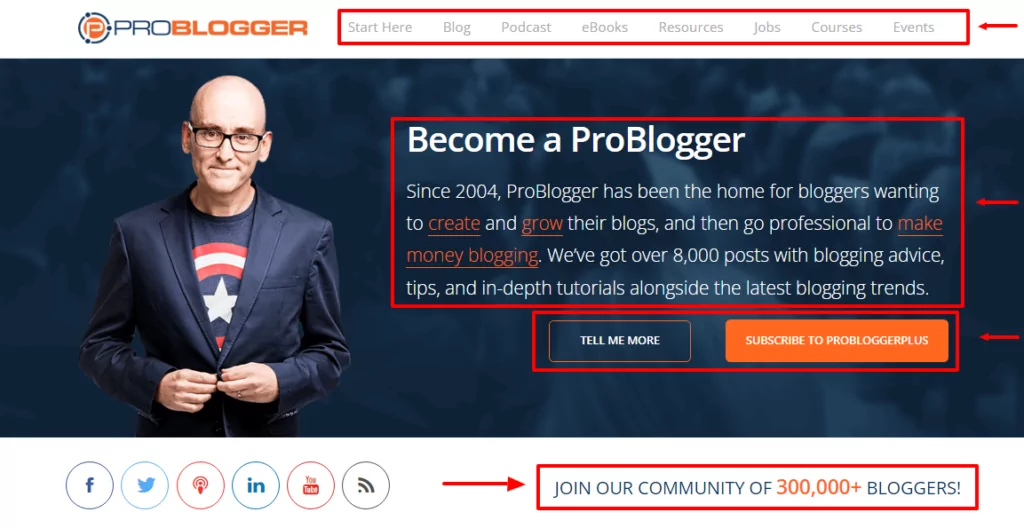
See? So simple.
Here’s another example from Zenbusiness:
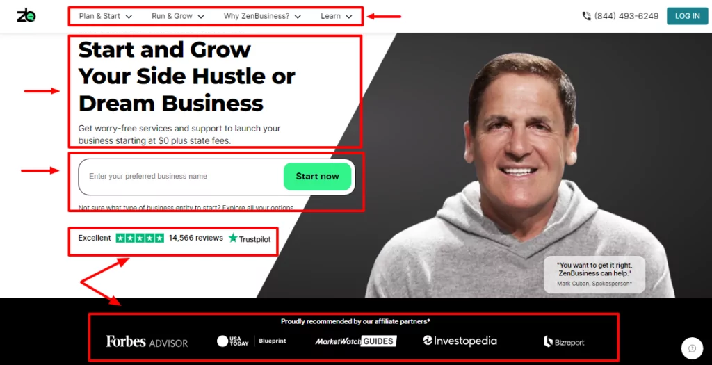
Simple, clean, and to the point.
Need another example? Check out Food Blogger Pro:
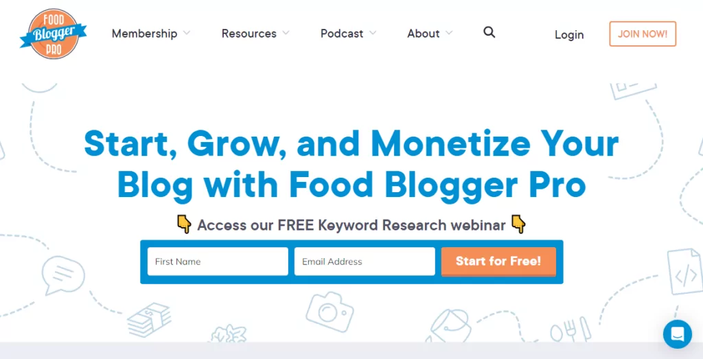
Are you noticing a pattern here?
Use the rest of your homepage to add more benefits and social proof. You could even include your price table on the homepage like Zenbusiness if you’re inclined.
Overall, the main components of a membership homepage design are:
- Simple but appealing design;
- Clear value proposition;
- Clear CTA;
- Benefits;
- Social proof.
Remember the main goal is to show your visitors why they should join your membership.
To see more examples, check out: Successful Membership Website Examples + How To Create Your Own.
I must say nothing is set in stone. Be creative with your homepage design, just don’t forget the basic principles.
Let us move on to the next page.
Membership Pricing Page Design Best Practices
Second in line, we have the pricing or membership tier page. This is where you get to shine especially if the prospective member came from the CTA on your homepage.
Many membership pricing pages fail because most beginners think the page is all about listing prices.
Nothing could be further from the truth. Take a look at the following pricing page, for instance:
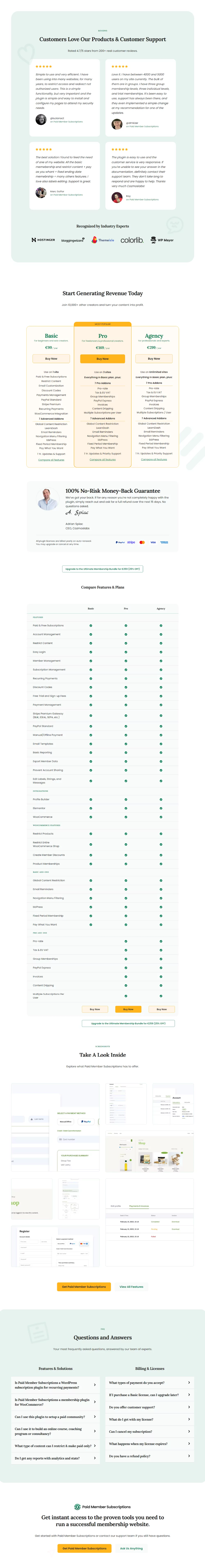
Even without scrolling further down the page, you can see a lot is going on here.
While you don’t necessarily have to go all out like the above example, you should use your pricing page as a sales letter.
You want to eliminate all doubts that the potential member has. It’s your golden chance to boost credibility and trust in the membership.
If you play your cards right, your pricing page can increase your conversion rates tenfold.
Using the Paid Member Subscriptions pricing page above as an example, clearly present the costs and features that come with each membership tier. Transparency is key since no one wants to feel short-changed later.
In addition, provide lots of social proof and an FAQ section to answer any questions that the visitor might have.
Don’t forget to reassure your prospects with a money-back guarantee. In addition, let members know the pricing page is secure by using an SSL certificate and displaying trust badges.
You should have received trust badges when you purchased your SSL certificate.
That said, the key components of an effective pricing page are:
- Detailed features of each membership tier;
- Transparent pricing;
- Social proof;
- An easy way to contact you;
- Money-back guarantee;
- FAQ section.
Designing the perfect pricing page needn’t be a challenge. With solutions such as Paid Member Subscriptions, you can start with a pre-made price table that you can visually customize, and go on from there.
Registration/Checkout Page
The member registration page is another important part of your membership website.
Prospects are ready to take the plunge when they get to this page. It is also your chance to collect as much information as you need about your members.
However, don’t go overboard. Only gather the information you need. For instance, you don’t need their shipping address if your membership doesn’t involve sending physical products.
You want to make the process of registration as seamless as possible to reduce friction.
Begin by offering streamlined forms that are easy to fill out. On top of that, offer several payment options that work with your target audience.
Additionally, you want to avoid any kind of distractions on the registration page. For instance, remove the navigation menu, social icons, and any other links that might take away your prospect’s attention.
Also, be transparent about any terms, conditions, and policies to avoid surprises later.
Here’s an example of a professional registration page by Cozmoslabs:
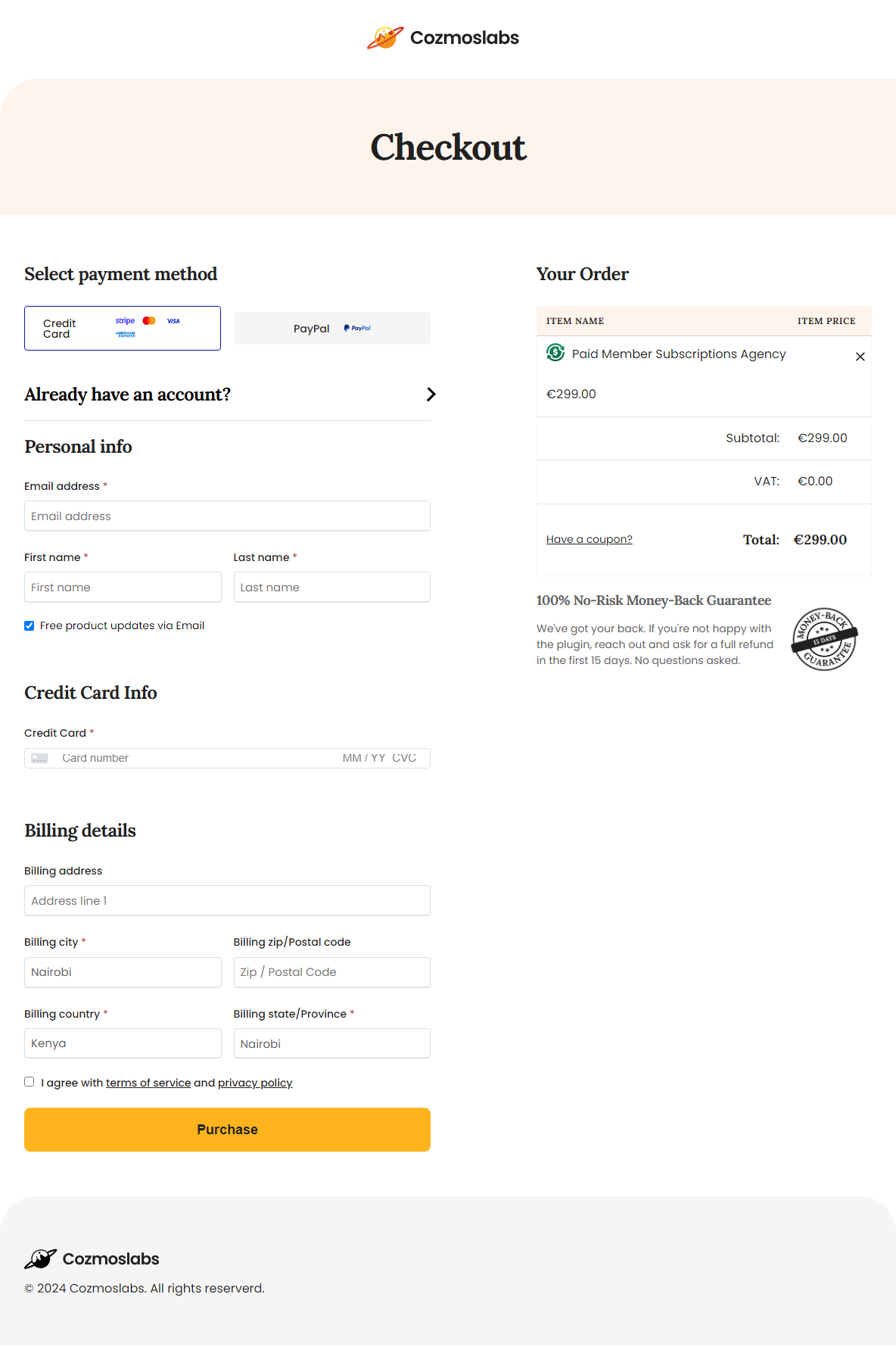
As you can see, it’s clean, simple, and doesn’t ask for unnecessary details.
Here’s another example by Elegant Themes:
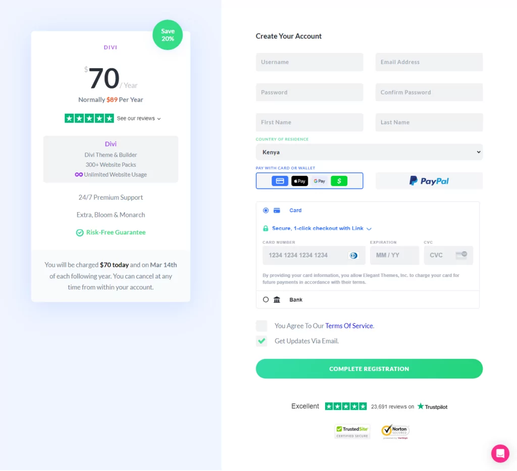
Again, it is clean and simple.
And how is our good friend Darren from ProBlogger fairing in this department?
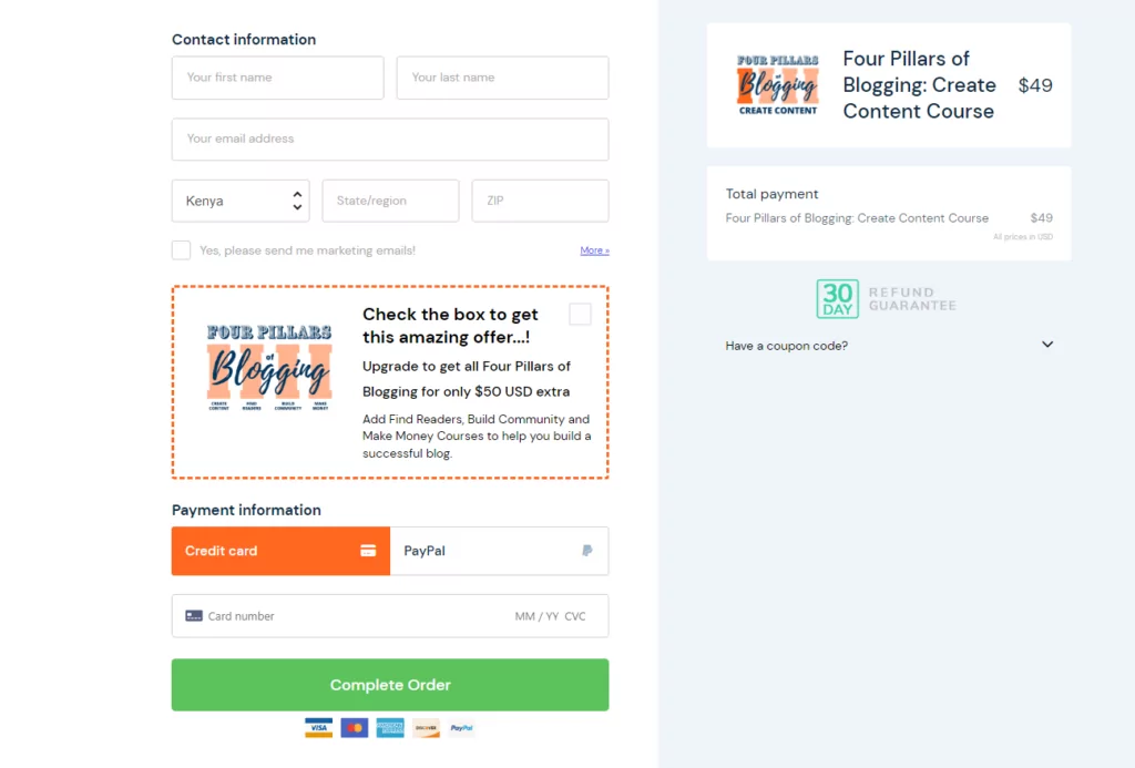
Again, clean and simple!
I think you see what I mean here.
In some cases, you might need longer registration forms to collect more information.
If so, you will be glad to know tools like Paid Member Subscriptions come with pre-designed form templates to help you create registration forms without coding.
Key components of membership registration/checkout pages:
- Streamlined forms;
- Multiple payment options;
- Transparency;
- Simple and elegant design that doesn’t distract users from subscribing.
After successful payment, you should redirect your new user to the member dashboard.
Membership Profile Page Design
And finally, we have the member profile page, which is the dashboard they see after registration and every time they login to your membership website.
On the member profile page, the user should have full control over their details and subscriptions.
Offer members the chance to edit the profile details and cancel membership at will.
In addition, you can personalize the user experience inside the dashboard offering the members exactly what they need based on their preferences.
This might include relevant resources, upsells, and anything else that makes the member’s experience truly rewarding.
Key components of the member dashboard:
- Personalization;
- User-friendly design;
- Account management.
You can customize your member profile page to your heart’s fill, so let your creative juices flow.
Paid Member Subscriptions Pro
With pre-designed templates for crucial pages, Paid Member Subscriptions makes running your membership site a breeze.
Get Paid Member SubscriptionsConclusion
As you’ve learned today, designing effective membership pages is easy, although it might require time investment on your part.
For effective membership page design, you should prioritize user experience, accessibility, and performance.
Membership websites that implement membership page design best practices can engage users and boost conversions successfully.
What’s your take? Let us know in the comments!
Related Articles
How To Create a Divi Membership Site
If you’re thinking of building a membership site in WordPress, you’ll need a solid theme and a membership plugin that pairs well with it. In this complete guide, we’ll show you how to create a Divi membership site using the popular Divi theme in combination with the Paid Member Subscriptions plugin.
Continue Reading
Membership Blog: Why Start One, Popular Examples and How To
I think you will agree starting a membership blog seems daunting, especially for a first-timer. Talk to just about any beginner who has never created a membership blog (or even a simple website), and they will field questions such as: Why should I start a membership blog? What kind of content, products, or services should […]
Continue Reading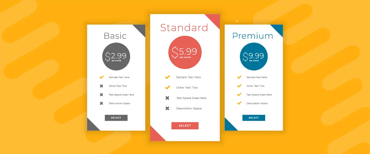
Creative Membership Level Names: How to Name Your Subscription Tiers
Struggling to come up with creative membership level names for your membership community? Or should you even be using creative membership tier names in the first place? Is it better to just keep things simple and straightforward? When you're building a membership website, coming up with your plan names can be a tricky subject. Don't […]
Continue Reading