

Table of Contents
Improving your product’s user experience is an ongoing task. Or at least, it should be.
Adding feature after feature in the hope of attracting more customers can easily become the norm and usability starts suffering. Without focusing on the big picture and constantly asking why, it’s easy to get off track. We’re guilty of it as well.
Usability, or simply put, ease of use, should be your number one priority. Trying to be everything for everyone is a clear path to disaster.
This is of course, easier said than done.
In this article, we’ll summarize the usability issues we’ve encountered in Profile Builder , our first and most popular plugin, and how we solved them.
Keep in mind we’re by no means usability experts, just constantly trying to improve our products.
How do you know you have a usability problem?
In order to fix it, you first need to be aware it exists.
So we did something we should have done a long time ago, which is ask users who install, use and then remove Profile Builder from their website, what’s the reason for it.
Just ask people why they stopped using your product and you’ll be surprised by how many are willing to share with you the details.
My colleague Madalin, implemented a feedback form which was triggered when someone tried to deactivate Profile Builder from their website.
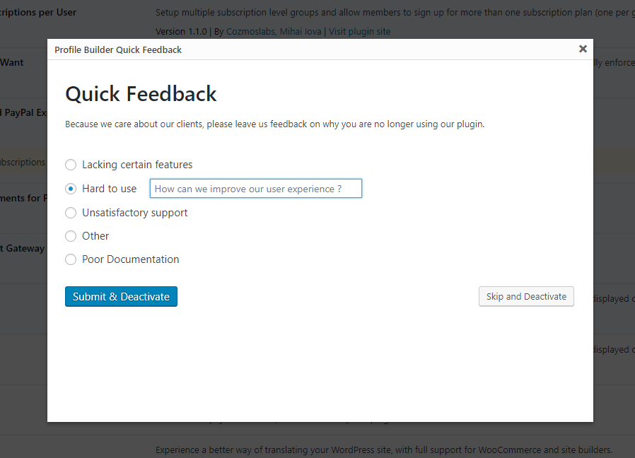
Besides asking them the reason for deactivation/removal, we gave them options to choose from, to save time and increase the number of responses we get.
After running the form for around three weeks, we got around 4K replies and the results below:
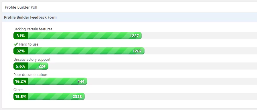
We also made sure to switch the order of the answers so that the results are not influenced by the position of a suggested answer.
While “Lacking certain features” was something to be expected, since the results were collected from free version users, two percentages were concerning:
- “Hard to use” counted for over 30% of the answers. It was a clear sign that there’s friction in the on-boarding process of some first time users.
- “Poor documentation” had over 16%, so while not critical, it was definitely a sign we could work on improving our documentation.
Improving Profile Builder usability
Now that we know we’re not perfect, let’s see what we can do about it.
We made it our top priority and each team member was given the task to play with the plugin, put himself in the shoes of a new user, and think of ways (and write them down) to improve the user experience.
After a couple of days, during one of our team meetings, each one of us shared the things he wrote down. I must admit there were quite a few.
The good part is that some of them were duplicates, suggested by multiple team members (definitely a good sign). Those were added immediately to the development todo list.
The rest were brainstormed and prioritized. In the end we narrowed it down to the following list:
- Redirect to Basic Information page after plugin activation (to guide and give new users a big picture of what they can do with the plugin)
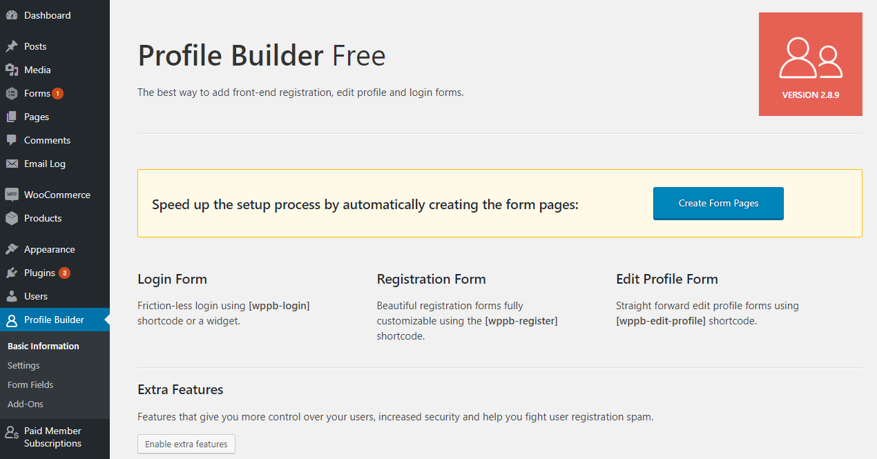
- Add a “Create Form Pages” button on Basic Information page to automatically create the Register, Edit Profile, Login, Lost Password, Userlisting etc. pages containing the forms.
- If the pages with the shortcodes already exist, the button will become “View Form Pages” and take you to a listing of all PB form pages.
- Visual shortcode insertion from the WordPress editor – a button that when clicked will open a popup and allow you to select the type of form and enter the arguments related to it (so you don’t have to copy paste the shortcode and search the docs for how to add a redirect argument for example)
- Converting shortcodes to dynamic Gutenberg blocks
- Transform Settings page into a tabbed interface (to declutter the current PB menu)
- Bypass “Anyone can register” setting from WordPress and remove notification (it just adds friction and an extra step in setting everything up)
- Remove other plugin notifications from all PB pages (users can get confused by global plugin notifications, especially when trying to set up a new one)
- Rename / Change text (we’re creating forms, but the word “Form” was nowhere to be found in our menu items name)
- “Manage Fields” became “Form Fields”
- “Manage Default and Extra Fields” became “Manage Form Fields”
- “Registration & Edit Profile” became “Register and Edit Profile Forms”
- and so on…
- Miscellaneous polishing (large list of tiny visual & text changes)
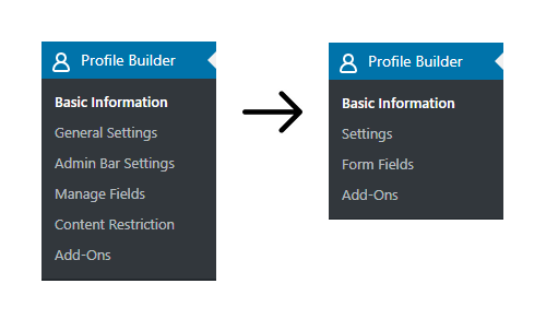
Here’s a before and after look at Profile Builder plugin menu.
This is how the new tabbed Settings page looks like:
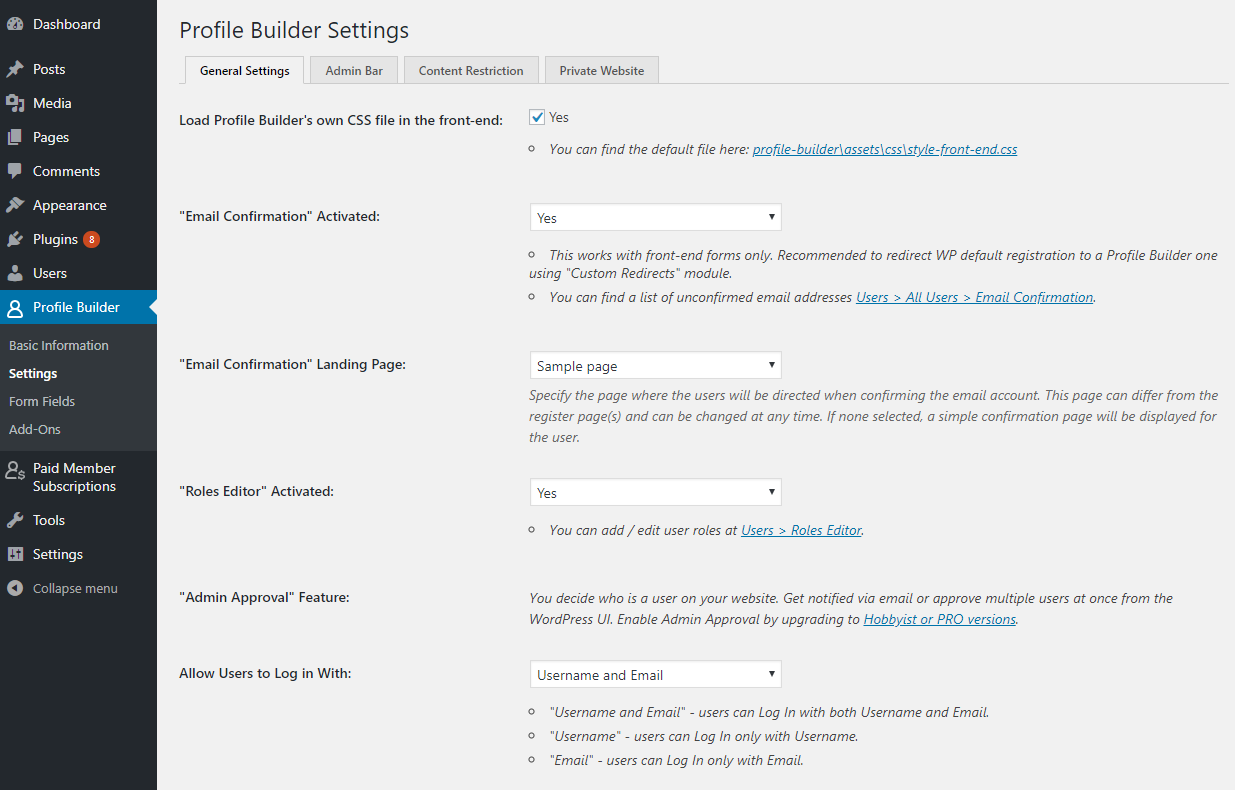
It groups General Settings, Admin Bar visibility settings, Content Restriction & Private Website functionality.
Basic Information page now allows you to create all forms and corresponding pages in one click:
Keep in mind these are all rather small and quick changes we felt we can do in a relatively short amount of time and which can have a positive impact on usability.
Let’s see what happened after implementing the majority of improvements listed above. Meanwhile we also added features ( like the ability to create a private website) to the free version.
After this, we continued to run the feedback form and collected the following data:
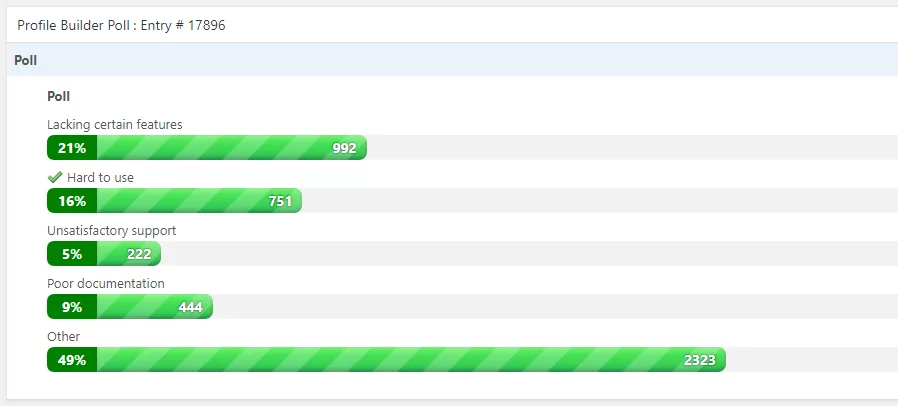
Let’s see how things evolved:
- Lacking certain features is now 21% ( down from 31% )
- Hard to use is now 16% ( down from 32% )
- Unsatisfactory support is now 5% ( the same )
- Poor documentation is now 9% ( down from 16.2% )
- Other is now 49% ( up from 15% )
As you notice “Lacking certain features” went down from 31% to 21% and most importantly “Hard to use” dropped from 32% to 16% (that’s a significant 50% drop!).
The change seemed quite impressive. Since the percentage drop from “Hard to Use” & “Lacking certain features” went into “Other”, and we also ask users to detail their reason in one or two sentences, I started to analyze the responses we got from people selecting “Other”.
The big majority of responses here were not related to the plugin functionality.
We got a lot of responses like: “this is temporary”, “temporary deactivation”, “just testing things out”, “upgrading to pro”, “don’t need – good work though”, “great plugin, just don’t need it anymore”.
So the majority of replies from “Other” were not something we could change or control (not actionable).
Analyzing the responses in “Other” I also found things which could go into the “Lack of features” category and some under “Hard to use”, but not a lot of them, to justify the drastic percentage change.
Conclusions
Focusing on ease of use and constantly collecting feedback from your users should be an ongoing task for every product company.
While I’m fully aware that the percentage change is not 100% accurate, it’s a clear sign of usability improvement.
The exact numbers are less important, what’s important is taking small steps in improving your products.
Even a tiny change of wording can go a long way. Take this review for example which was left by one of Profile Builder’s free users, after noticing the simple menu text change from “Manage Fields” to “Form Fields”.
After this, we’ve started to collect user feedback on deactivation from all of our plugins. So Paid Member Subscriptions is next to get a proper usability polishing.
If you’re a Profile Builder user let us know what you think about the new improvements.
Also, if you haven’t tried Profile Builder yet and are looking for a reliable user registration plugin, take it for a spin or play with our demo version.
Related Articles

WordPress Profile Builder: a Front-end User Registration, Login and Edit-Profile Plugin
Easily Login, Register and Edit your Profile Directly from the Front-end Profile Builder lets you add front-end forms that give your users a more flexible way to register, log in, and modify their profile information. If you allow public registration on your site, you don't want to force your users to use the backend WordPress […]
Continue Reading
Profile Builder Update: No More Profile Builder Hobbyist?
If you’re already a Profile Builder user, you might have noticed some changes around here in the past few weeks. And that’s especially if you’ve purchased the Hobbyist version of Profile Builder. And you’d be right! Some changes did take place within the plugin, and thus, that’s what we’ll talk about in this blog post, […]
Continue Reading
Top 10 Gravity Forms Alternatives You Need to Consider in 2026 (Free & Paid)
In the market for Gravity Forms alternatives? I think you will agree that finding the best online form builder is a bit tricky, especially with the many options out there. One such option is Gravity Forms, a well-known form builder in the game. But even with all the rave reviews, is it the best software […]
Continue Reading