
Table of Contents
One of the awesome features of Profile Builder is the user listing. As the name suggests, you can create a listing of your users by selecting different criteria, like which user roles to display, the number of users to display on a page, a default sorting, be it by username, first name or other default and extra fields, and so on, that you can display in your pages via a shortcode.
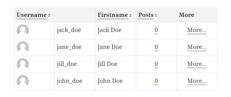
The default template, used to display the listing, is a table and as you can see in the image below it looks quite good out of the box, when it is displayed on a large screen. But, as you may already know, tables don’t really look all that great on small screens, especially when they have lots of columns.
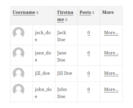
In some cases they look terrible even with a few columns. Five columns were more than enough to ruin the overall tidy aspect of the above table. So, the goal is to make them look pretty even on small screens.
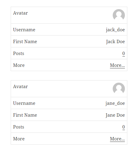
Using the pure CSS solution the guys at Living Social found for their problem, we’ve transformed the crammed table into something easy to read and understand with just a few lines of CSS.
Let’s see the code
These improvements will be present in a future update of Profile Builder, but for the impatient and for any others looking for a pure CSS solution to responsive tables I’m going show what needed to be done in order to achieve this good looking table.
The solution uses the power of CSS pseudo-elements, the ::before pseudo-element to be more exact and its ability to get content from an attribute of the targeted element.
Let’s take the default user listing template. We want the column titles to become the labels that are displayed to the left of our new rows. In order to do this we will add a new attribute to the table cell.
{{{avatar_or_gravatar}}}{{meta_user_name}}{{meta_first_name}} {{meta_last_name}}{{{meta_number_of_posts}}}{{{more_info}}}


{{{avatar_or_gravatar}}}{{meta_user_name}}{{meta_first_name}} {{meta_last_name}}{{{meta_number_of_posts}}}{{{more_info}}}
Now let’s sprinkle some CSS magic dust
@media screen and ( max-width: 720px ) {

    /*
     * This little bit of code will add the pseudo-element and populate it with
     * content from the table cell's data-label attribute
     */
    .wppb-table td:before {
        content: attr(data-label);
        float: left;
    }


    /*
     * Let's add a little more styling to make the table look clean
     */
     .wppb-table {
         border: 0;
     }

    .wppb-table thead {
        display: none
    }

    .wppb-table tr {
        display: block;
        margin-bottom: 30px;
    }

    .wppb-table td {
        display: block;
        text-align: right;
        border-bottom: 0;
    }

    .wppb-table td:last-of-type {
        border-bottom: 1px solid #e1e1e1;
    }

    .wppb-table .wppb-posts,
    .wppb-table .wppb-moreinfo{
        text-align: right;
    }

}
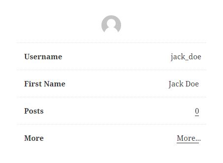
A bit more
If you want to go a step further and create a minimalist user listing you can use the style below.
    .wppb-table {
        border: 0;
    }

    .wppb-table thead {
        display: none
    }

    .wppb-table tr {
        display: block;
        margin-bottom: 30px;
    }

    .wppb-table td {
        display: block;
        text-align: right;
        border: 0;
        border-bottom: 1px dotted #e1e1e1;
        padding: 15px;
    }

    .wppb-table td:last-of-type {
        border-bottom: 0;
    }

    .wppb-table .wppb-posts,
    .wppb-table .wppb-moreinfo{
        text-align: right;
    }

    .wppb-table td:before {
        content: attr(data-label);
        float: left;
        font-weight: bold;
    }

    .wppb-avatar:before {
        display: none;
    }

    .wppb-table .wppb-avatar {
        text-align: center;
    }
Related: Best WordPress Member Directory Plugins Compared
Related Articles

WordPress Profile Builder: a Front-end User Registration, Login and Edit-Profile Plugin
Easily Login, Register and Edit your Profile Directly from the Front-end Profile Builder lets you add front-end forms that give your users a more flexible way to register, log in, and modify their profile information. If you allow public registration on your site, you don't want to force your users to use the backend WordPress […]
Continue Reading
Profile Builder Update: No More Profile Builder Hobbyist?
If you’re already a Profile Builder user, you might have noticed some changes around here in the past few weeks. And that’s especially if you’ve purchased the Hobbyist version of Profile Builder. And you’d be right! Some changes did take place within the plugin, and thus, that’s what we’ll talk about in this blog post, […]
Continue Reading
Top 10 Gravity Forms Alternatives You Need to Consider in 2025 (Free & Paid)
In the market for Gravity Forms alternatives? I think you will agree that finding the best online form builder is a bit tricky, especially with the many options out there. One such option is Gravity Forms, a well-known form builder in the game. But even with all the rave reviews, is it the best software […]
Continue Reading
hi Mihai Iova, thanks for this code. It was hard to make user listing table made responsive. Also responsive website is great for viewing all types of device and browser.
Thanks Mihai, it would be great if you all could post more CSS snippets of ways to make the various Profile Builder pages look different.