
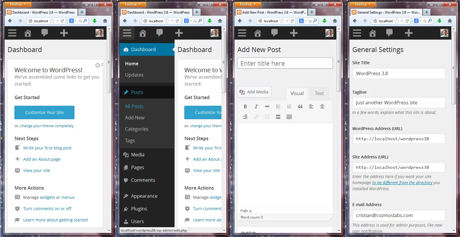
WordPress 3.8 is just around the corner and I can honestly say it’s THE most exciting release since ever! With the WordPress 3.8 RC2 available for download, we’re only days away from the excellently polished WordPress 3.8 UI.
Much more than just a new skin
You can see by the title of this post that I’m quite excited about this release. The old design has been around since 2.7 with only minor improvements across the board (was back in 11’th of December 2008 when 2.7 was launched, 5 years ago!). While the new, WordPress 3.8 UI, keeps most of the elements in the same place, it’s clearly the biggest thing to happen visually in the last 5 years.
WordPress 3.8 UI is stunning to look at and work with, but it also represents the best responsive/mobile implementation we’ve seen for the WordPress backend so far:
- the top and sidebar menus have been re-envisioned for small resolutions
- the sidemenu is now hidden by default and can be much more easily extended on small devices.
- the Add New Post works wonderful for resolutions under 600px
- every button and link is just a little bit larger, so you can tap them even if you have big thumbs
- comes with its own flat vector icon font for the admin UI, called dashicons
- it’s not just a refined implementation of what was before, it was created with devices of all sizes in mind
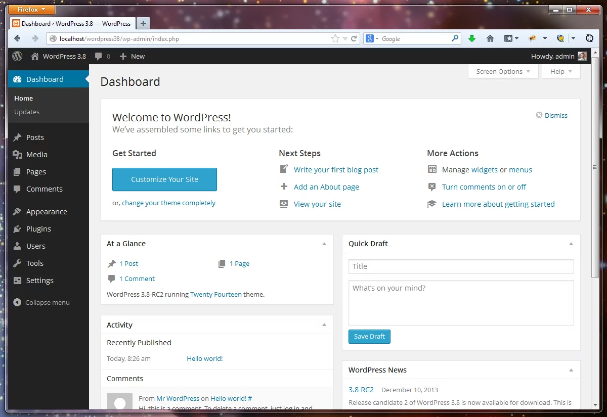
WordPress 3.8 UI works a treat
Besides the excellent responsive design, there are other things that make WordPress 3.8 even more straight forward to work with on a day to day basis:
- there is much better contrast than we had before. The dark sidebar and top menu differentiate a lot better from the content creation areas.
- typography wise, WordPress 3.8 has got a big revamp with the help of OpenSans font.
- we now have an almost flat design. There are some subtle 3D effects on the buttons, but that’s it.
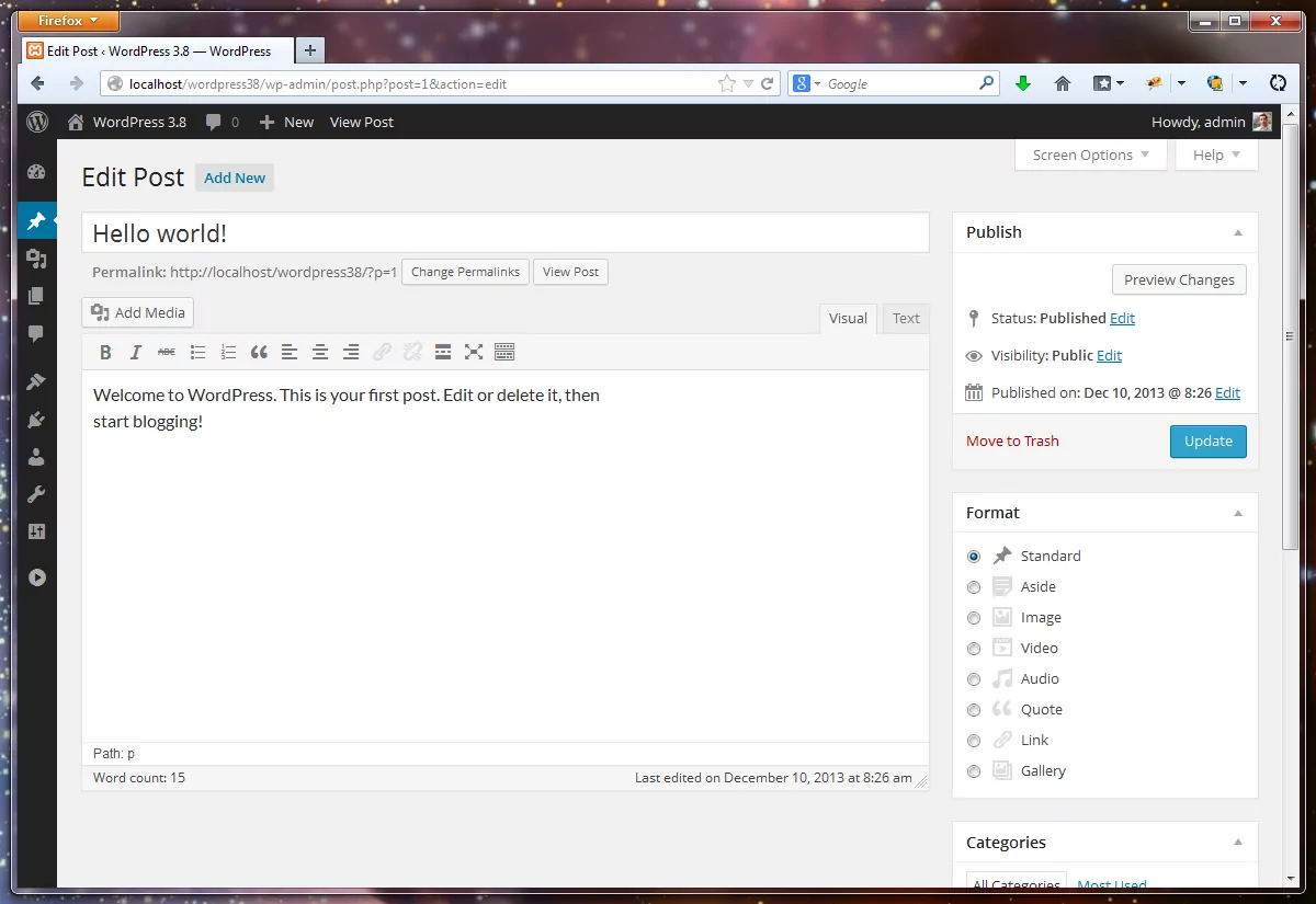
- the edit screen is a much nicer place to be.
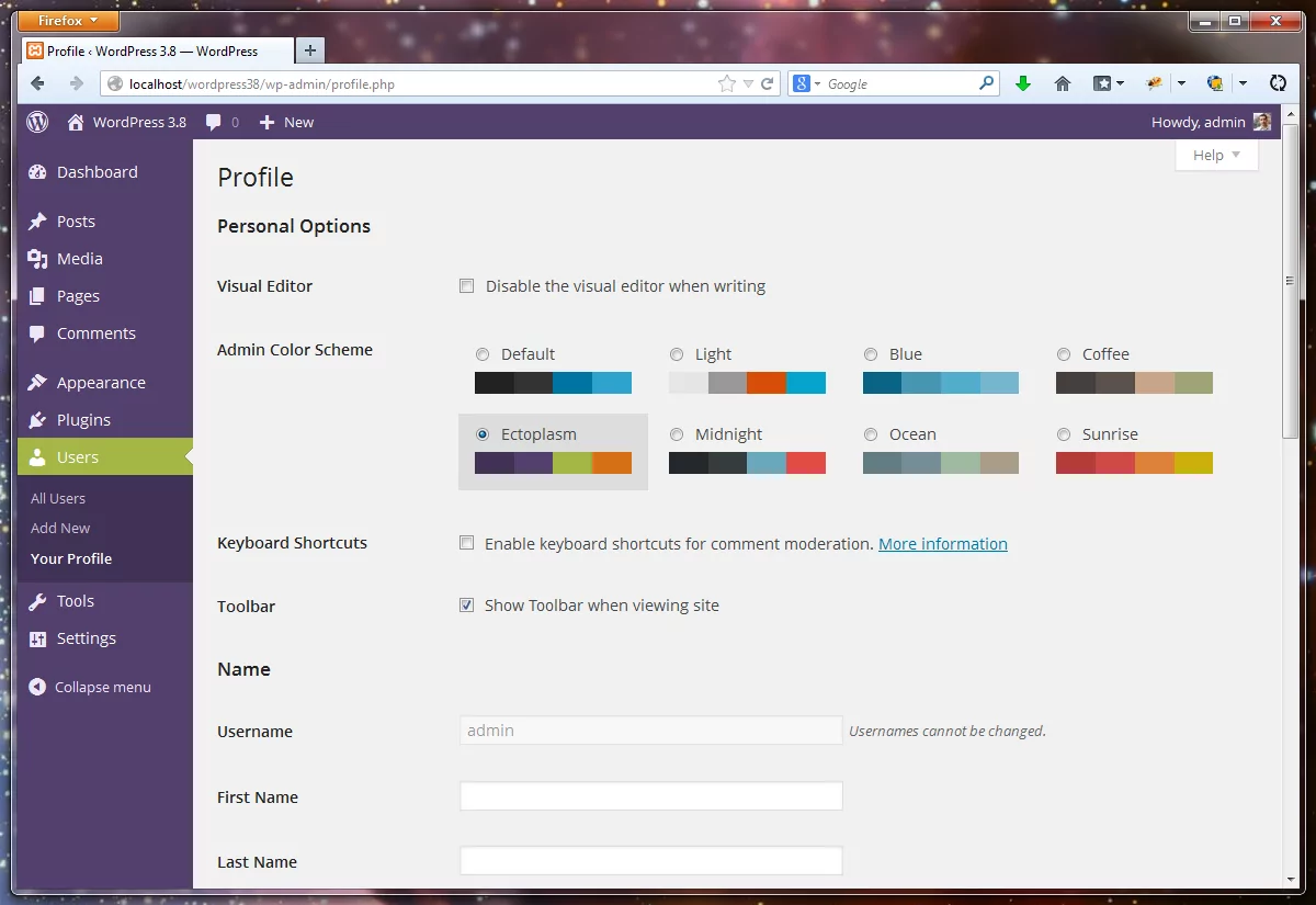
- with WordPress 3.8, the dashboard styles have a lot more soul than before. The Ectoplasm Color Scheme can really pimp your WP site : )
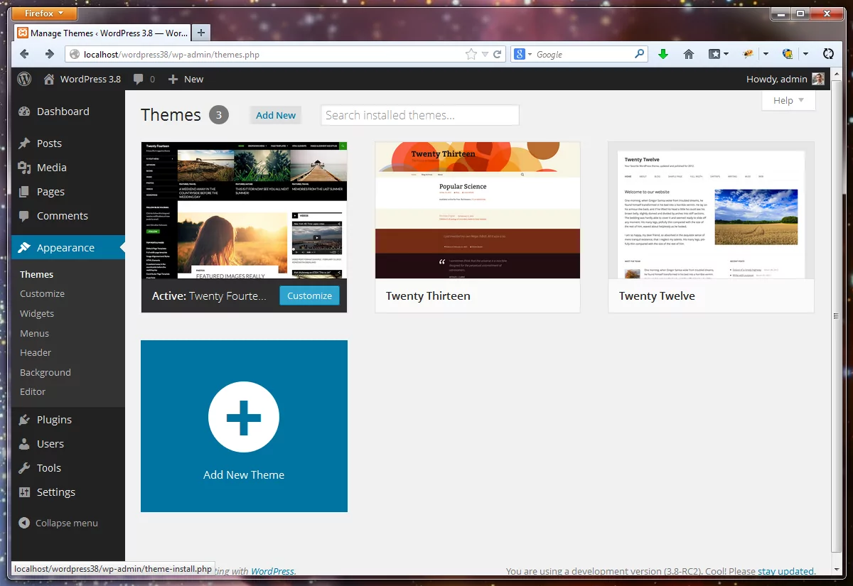
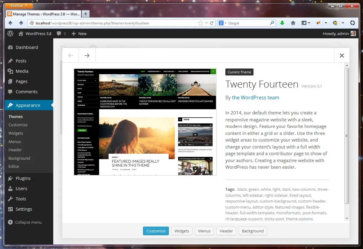
Adding new Themes to WordPress 3.8
Adding new themes to your WordPress 3.8 website has also changed. We now have a more app like interface, with a big “Add New Theme” button. The Theme details popup is also much nicer than what we had before, and usable to.
If you like to test a lot of themes for your projects, now it’s quite a lot easier to find a perfect theme.
Nothing this extensive was changed in the Plugins UI, but I guess a LOT more people will interact with the Themes interface ( just a “handful” of people who blog at WordPress.com ) than with the Plugins, so I guess it’s ok to push for the Theme UI revamp in this version.
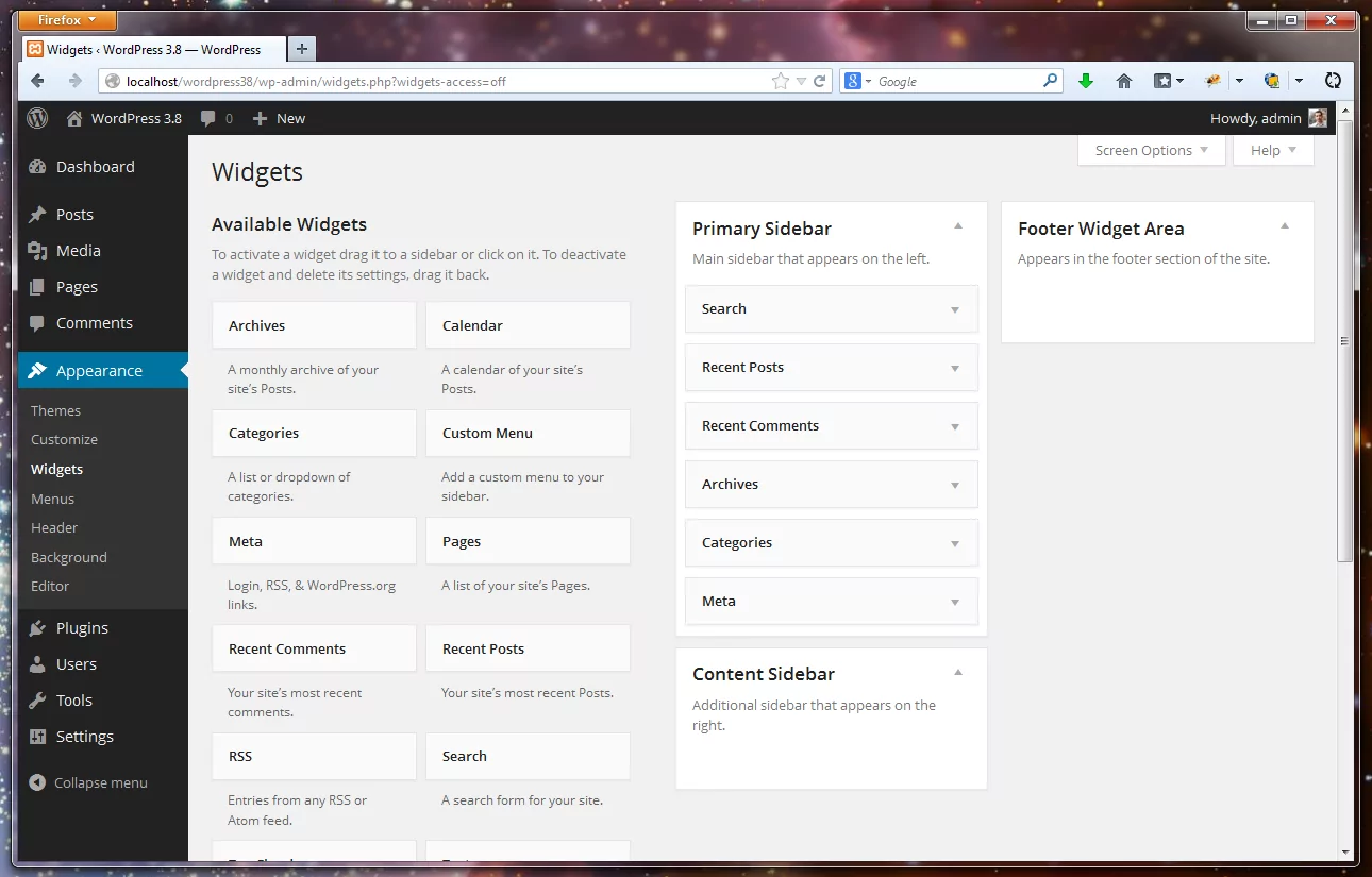
The New WordPress 3.8 Widget Areas
Update: As Kraft mentioned in the comments, on the Widgets page, you can now click a widget from the widget list and indicate what sidebar it should be used for. So the widgets are a step in the right direction after all!
The WordPress 3.8 Widget Area interface is different from the old one. However, besides smartening everything up to fall in line with the overall design of WordPress 3.8, it’s actually a step backwards in my opinion, and here’s why:
- the Sidebars, previously all on the right, one under the other, can now be ordered in two columns by the theme
- the above means, we have LESS space for the actual widgets that are now white rectangles with a lot of white space
- and to top it off, while this Widgets interface is actually responsive, on larger resolutions we have a maximum of 2 columns of Widgets
Those were the facts, so why is this worse: there will almost always be more Widgets than Sidebars.
Without something like a floating Sidebar area, inactive and lower widgets now have to be dragged from the bottom and you’ll end up scrolling quite a lot. The reason it’s worse than the old design is because in the old one you could have as many widget columns as you wanted, provided you had a big enough screen. That made adding new widgets a lot easier, without having to scroll so much from the bottom.
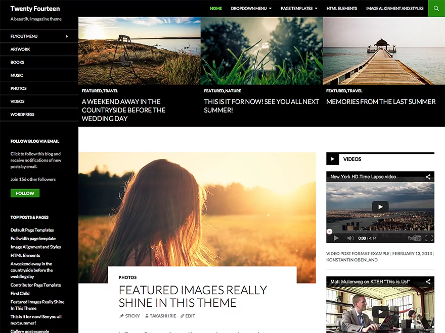
A New Default Theme: Twenty-Fourteen
I really like the new default theme. It’s a good companion to the new WordPress 3.8 UI, making both the backend and the front-end feel more like a well crafted app, than anything else.
The way you see it right out of the box doesn’t do it justice, without proper content in place. And, if I’m not mistaken, it’s the FIRST magazine like default WordPress theme. .
From it’s own description it “lets you create a responsive magazine website with a sleek, modern design. Feature your favorite homepage content in either a grid or a slider.”
- responsive magazine design.
- feature favorite content in either a grid or slider.
- use 3 widget areas to customize your website.
- full width page template.
- contributor page template to show off authors.
WordPress 3.8 Is The Design Revamp WordPress Deserved
The old design was quite functional and nice to look at. It served it’s purpose for the past 5 years and survived with only gradual improvements. But sometimes you have to scrap even good things in order to move ahead.
The WordPress 3.8 UI redesign feels like it’s here to stay for another 5 or more years in this general look and feel. I’ve also heard it’s A LOT easier to work with (haven’t tried it yet), so building custom backend themes a lot simpler than ever.
On the Widgets page, you can now click a widget from the widget list and indicate what sidebar it should be used for. Inactive widgets, though, still need to be dragged.
Side note: The floating subscribe form on your site completely blocks the view of the comment form when writing a comment on mobile. Any typos are from typing blind!
Just tested this and you’re absolutely right! I guess I didn’t do my research right. Will update the article to reflect this. Thanks!
Also fixed the email floating bar on our website on smaller resolutions. I guess it’s time we convert this to a responsive design. Something else to do next year 🙂
I have used wordpress as the CMS for several of our web design client’s websites and they like the old backend color scheme and look. Now if I update their wordpress to new version the backend look will change. This change is a unrequested and unnecessary change as far as my clients are concerned. I’m not sure how they will react but I’m sure many of my clients will ask me why I changed their backend look or why change anything for their site when they didn’t request it. What shall I do?
I actually think the new style is a big step backward in tems of usabilty (mostly readability). The old style was a lot easier on the eyes and easier to pick out separate things because there were more separators/boundaries. Not only was the old style not an option under 3.8, but there was no feasible way for me to uninstall 3.8. They also broke the top admin bar at 600 wide and below, and i cannot yet find a workaround for that.
I beg to disagree with you on, “The old design has been around since 2.7 with only minor improvements across the board (was back in 11′th of December 2008 when 2.7 was launched, 5 years ago!). While the new, WordPress 3.8 UI, keeps most of the elements in the same place, it’s clearly the biggest thing to happen visually in the last 5 years.”
The biggest change in wp withing this period you mentioned is probably the support for custom post types that came around wp 3.0. This change enabled wordpress to become a fully fledged CMS platform than a blogging platform. Many of the new plugins like ecommerce plugins, reservation plugins, classified plugins, premium theme wouldn’t exist today if these support for custom post types were not introduced around wp 3.0 and later.
Custom Post Types ARE the best thing to happen to WordPress ever. I was only talking about visual changes: ” the biggest thing to happen visually”
I understand that you’re focussing on the UI. Yet I’m afraid I con’t share your excitement and evaluation of the new Backend Design. In my eyes, the Design doesn’t seem to be a great achievement to the previous version. And, of course, responsiveness is nice to have, but honestly, I do not think a significant share of the community will ever access the WP backend by a mobile device to a great extent.
For my part, I would highly appreciate if the further development would focus on more vital and productive topics like a better media management, rather than User Interface improvements.